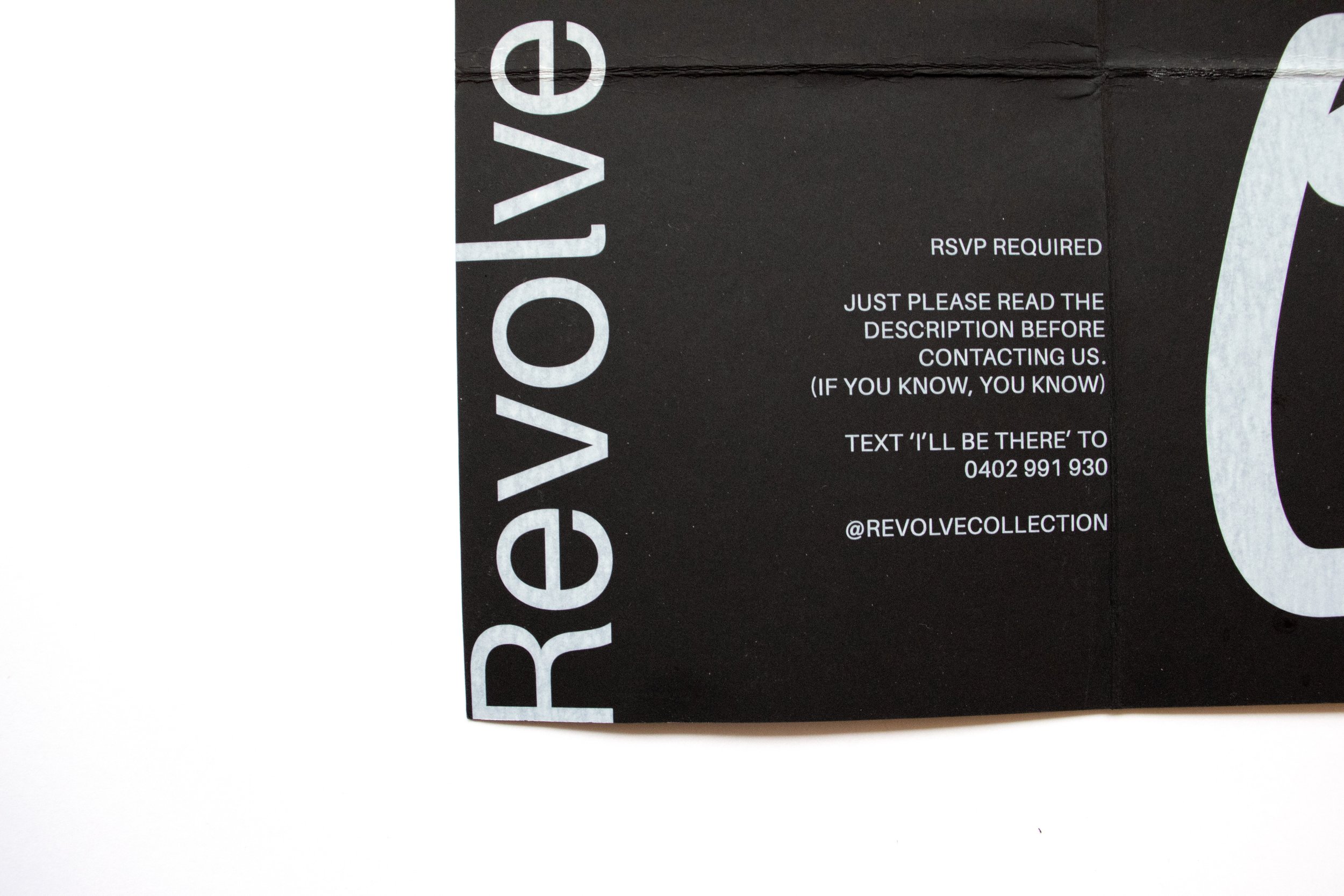
A learning experience with white ink (to say the least).
-
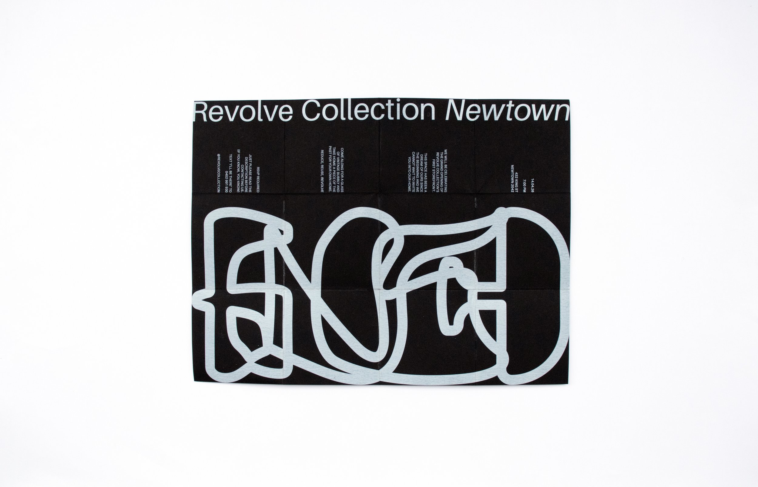
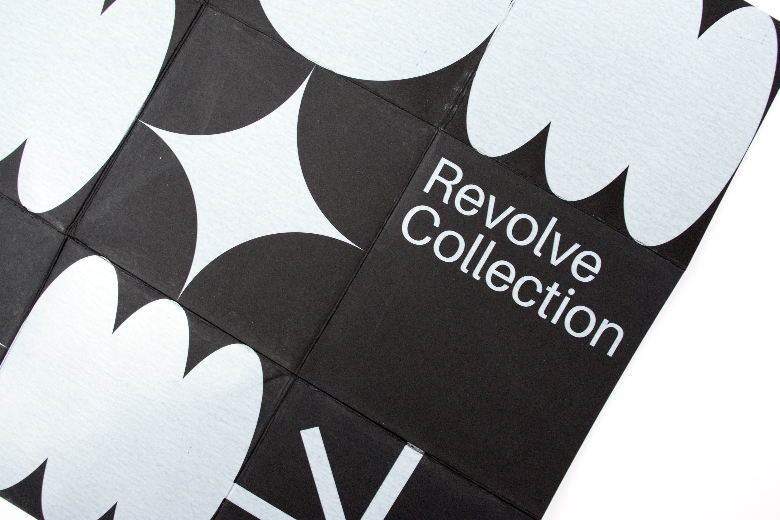
To design and print a promotional flyer for any chosen company or business that has an element of sustainability. I chose to create a flyer for the hypothetical storefront launch of my own business, Revolve Collection.
-
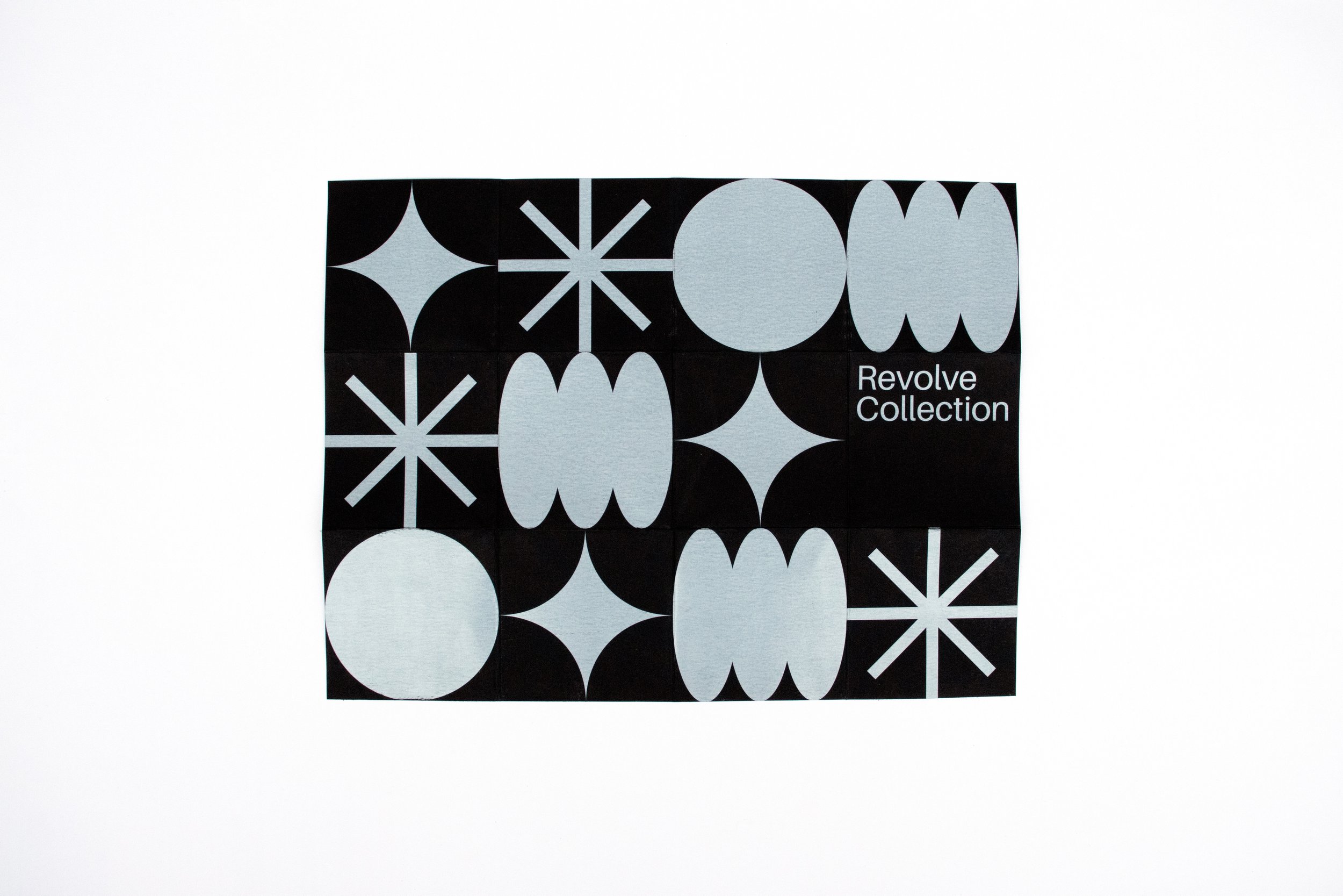
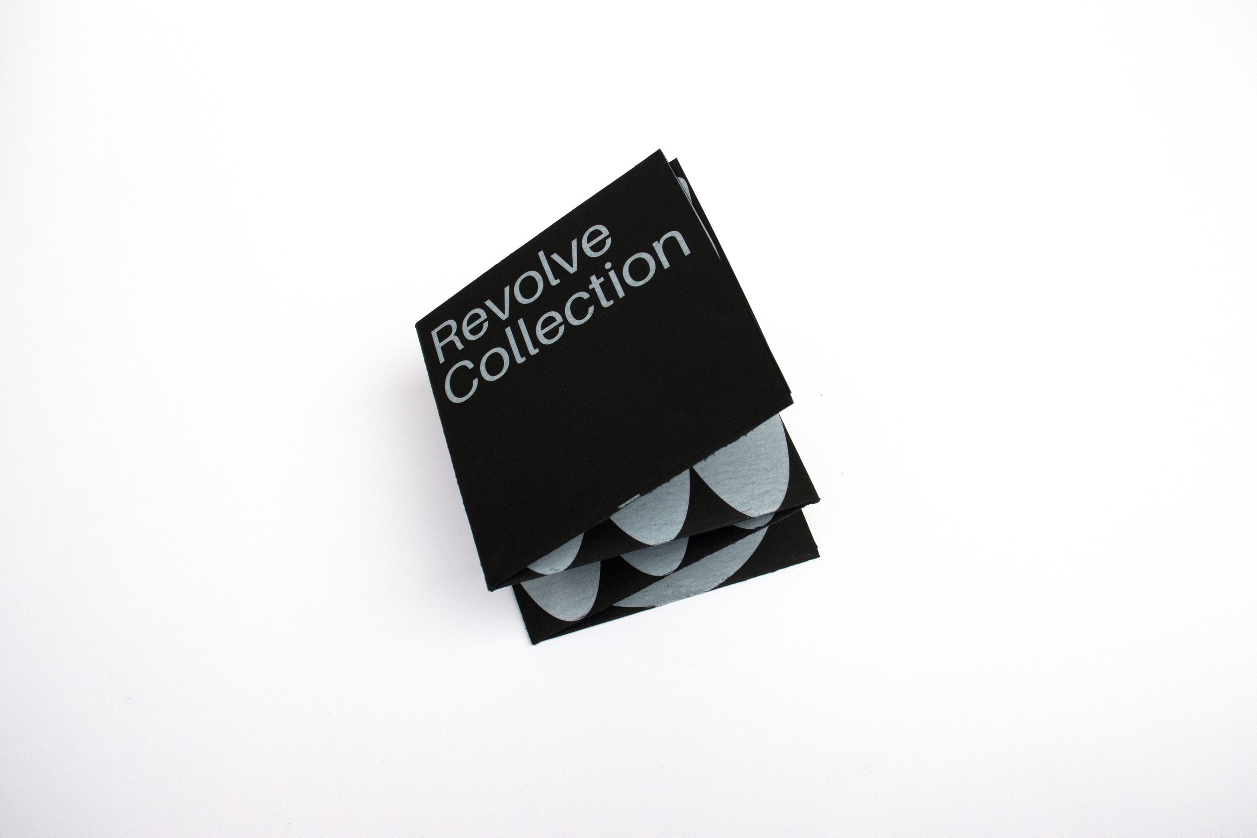
Sustainability is visualised through Revolve Collection’s brand elements — fun patterns that are reminiscent of vintage design with a modern spin. I decided to use white ink on black card to extend these elements into a tactile experience. Using white ink for the first time, this project certainly presented a learning curve. Here, I learnt that communication with your printer is crucial to a perfect outcome.
-
By bringing the brand elements to life through this hands-on unfolding experience, the user is made aware of what this brand stands for - presenting old things in a new light.